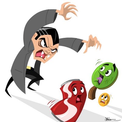
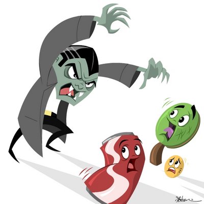
 Ok so here is my second post for week one. I posted two different versions obviously, one with bright colors and another with more muted colors.
For this post I wanted to go back to my animation roots, simple shapes and strong silhouettes. I was thinking a cemetery background with a monochromatic color scheme would have worked well with these characters but I didn't have time and may revisit this in the future.
And now on to week two!


3 comments:
Greg, awesome! The monochromatic cemetery background would work for both of them. I hope to see more in this style.
the brighter one has my vote.
great! I like the green faced vampire...looks more dead ...
Post a Comment